Arcadia
Social score-tracking for arcade gaming
Social score-tracking for arcade gaming
Context

When
October - November 2022
Where
Google UX Design Certificate project
Who
Independent project
Why
Many modern arcades have not actually changed much
since the 00's, only upgrading their games. Joy and
excitement are central to the arcade gaming
experience, but our constant use of the digital space
for virtually everything has changed our expectations
of what a modern experience should be like. And is
there a better 'gamifiable' experience than keeping
track of your scores and prize tickets?
In this project, I used traditional design thinking tools and Figma to prototype a high-score tracking app.
In this project, I used traditional design thinking tools and Figma to prototype a high-score tracking app.
Empathize
I used this phase of the design thinking process as an
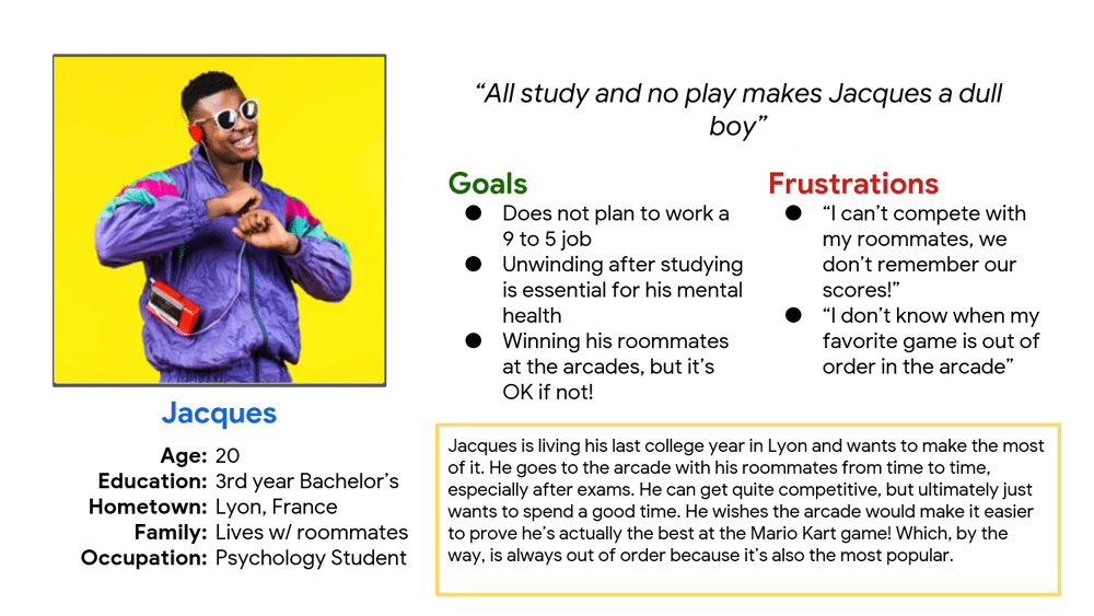
exercise to write user interview scripts and user personas. For instance, this is Jacques!
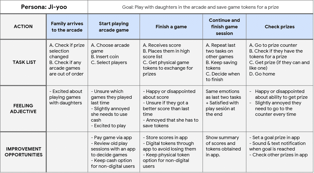
 For instance, Ji-yoo's user journey, a single mother of
two girls with the big prize in mind, includes frustration
over having to carry around the prize tickets the family
wins at the arcade.
 For instance, Ji-yoo's user journey, a single mother of
two girls with the big prize in mind, includes frustration
over having to carry around the prize tickets the family
wins at the arcade.
Define
1
Prize tickets
Managing physical tickets is impractical2
Compare high scores
Comparing between friends is hard if you can’t keep track3
Prize selection
Checking what your tickets can unlock can get tiring4
Out of order!
You realize your fav game is out of order only when you get to the arcadeValue proposition:
• Be notified when a friend beats your score
• Check the leaderboard of a specific game
• Check if a game is out of order
• Track your progress in a certain game
• Review selection of games at your arcade
• Search for new rivals in the app
Problem statement 2: Ji-yoo is a mother of two teenage girls who needs to
manage her arcade game tickets digitally because she's
saving for a big prize and she does not want to lose
them.• Check the leaderboard of a specific game
• Check if a game is out of order
• Track your progress in a certain game
• Review selection of games at your arcade
• Search for new rivals in the app
Value proposition:
• Set a prize goal
• Use the phone to pay instead of coins
• Manage game tickets digitally
• Register score automatically
• Manage the account for a minor
• Book a prize with in-app prize tickets
• Use the phone to pay instead of coins
• Manage game tickets digitally
• Register score automatically
• Manage the account for a minor
• Book a prize with in-app prize tickets
Ideate
Crazy Eights
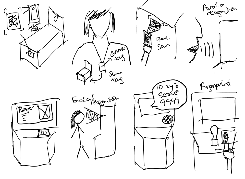
I began the ideation process by using Crazy 8's to come up with ideas for saving a game score automatically in an app. The ideas selected for prototyping are highlighted - the main reason behind the selection is feasibility and cost. Installing scanners in the arcade games would be considerably costly - it makes more sense to label the machines and use the phones to scan them. Idea 5 is also prototyped because it would allow users to track high scores even if the machines aren't labeled.
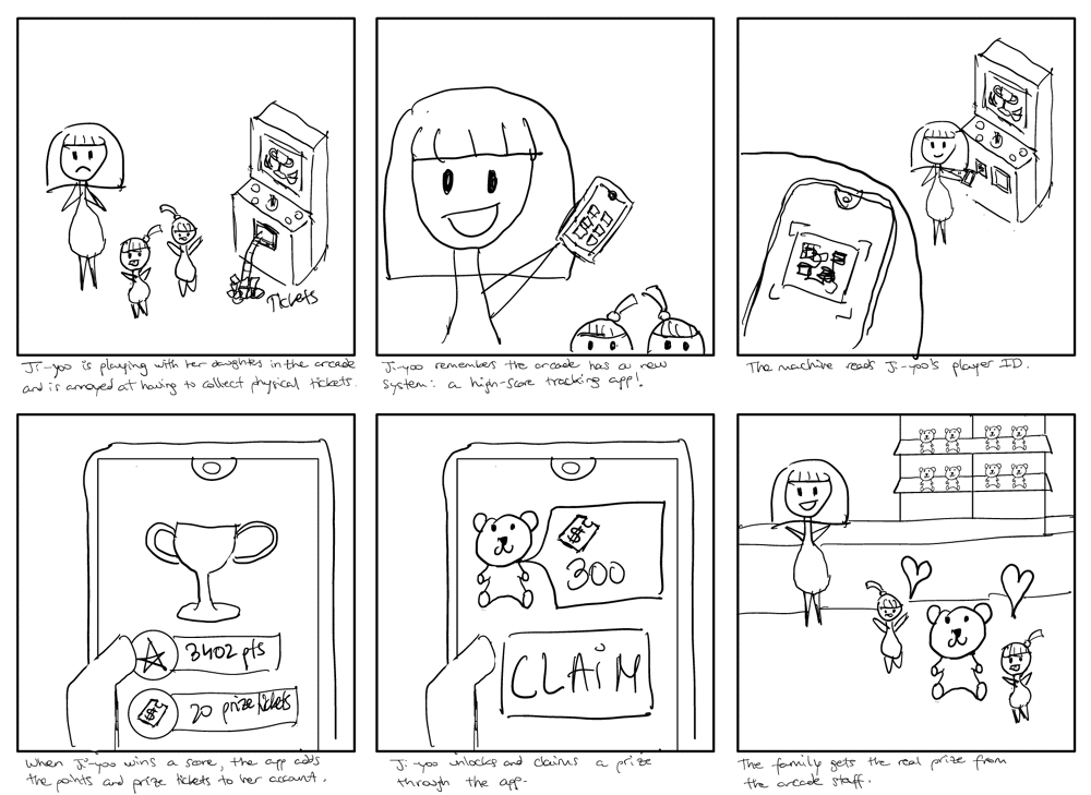
Next, I sketched a big picture storyboard centered on Ji-yoo's user persona. The app would track her scores but, most importantly, her prize tickets. When reaching their ticket goal, Ji-yoo could claim it through the app and make her daughters happy. I sketched a close-up storyboard centered on the process of claiming a prize through the app, but I won't illustrate it here for brevity's sake.
 Wireframing on paper
I wrote down the screens and features I wanted to include and started wireframing on paper, aiming for at least 3 wireframes per screen.
The homepage was the screen I had the most trouble with. Initially, I envisioned a layout that would mimic an actual arcade machine, with a big screen above and a few big buttons below. However, it was problematic: users could be confused by the atypical layout, the lack of a bottom bar would make the app harder to navigate, and the app had a risk of feeling too retro.
I ended up going for a middle-ground solution that kept the big screen at the top but included a taste of the app's other features, and a navigation bar.
-1000w.jpg)
-1000w.jpg)
-1000w.jpg)
I began the ideation process by using Crazy 8's to come up with ideas for saving a game score automatically in an app. The ideas selected for prototyping are highlighted - the main reason behind the selection is feasibility and cost. Installing scanners in the arcade games would be considerably costly - it makes more sense to label the machines and use the phones to scan them. Idea 5 is also prototyped because it would allow users to track high scores even if the machines aren't labeled.
1) Scan QR code on machine with phone 2) Let machine scan physical gamer tag3) Let machine scan gamer tag in app4) Audio recognition

5) Manually add score by searching game in app6) Access player account w/ facial recognition7) App reacts to a sound cue8) Access player account w/ fingerprint recognition
StoryboardingNext, I sketched a big picture storyboard centered on Ji-yoo's user persona. The app would track her scores but, most importantly, her prize tickets. When reaching their ticket goal, Ji-yoo could claim it through the app and make her daughters happy. I sketched a close-up storyboard centered on the process of claiming a prize through the app, but I won't illustrate it here for brevity's sake.
 Wireframing on paper
I wrote down the screens and features I wanted to include and started wireframing on paper, aiming for at least 3 wireframes per screen.
The homepage was the screen I had the most trouble with. Initially, I envisioned a layout that would mimic an actual arcade machine, with a big screen above and a few big buttons below. However, it was problematic: users could be confused by the atypical layout, the lack of a bottom bar would make the app harder to navigate, and the app had a risk of feeling too retro.
I ended up going for a middle-ground solution that kept the big screen at the top but included a taste of the app's other features, and a navigation bar.
-1000w.jpg)
-1000w.jpg)
-1000w.jpg)
Prototype
Low-Fidelity Prototype
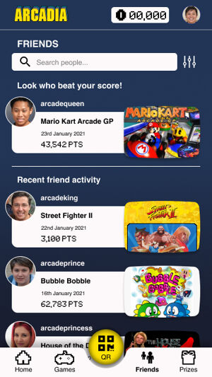
These are some examples of low-fidelity interfaces I designed in Figma:
-300w.jpg)
-300w.jpg)
 Usability Testing
I carried out a supervised usability test with 3 users consisting of 5 tasks, and identified the following issues:
• The Back icon on the upper left corner confused all 3 users.
• The process to add a game score manually was unclear.
• Two users suggest the QR button should actually depict a QR code to convey its purpose.
High-Fidelity Prototype
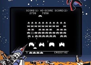
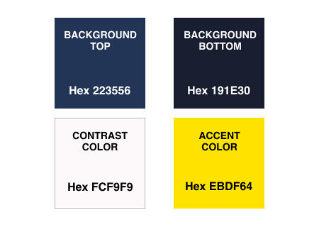
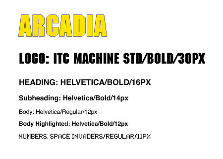
Hi-Fi Figma PrototypeFor the high-fidelity design, I wanted a style that evoked nostalgia and the 80's craze for arcades but still looked modern to users. I got inspired by Space Invaders, one of the most popular games of the era: I designed pixel-based icons and used a blue-yellow color palette. I thought of using a pixel-based font for the app's headings, but I dismissed the idea in favor of legibility. I did use that font for representing numbers, as we are much more used to reading numbers in that style. Anywhere else except for the logo, I used Helvetica, as it is legible and it was a popular font in the 80's.
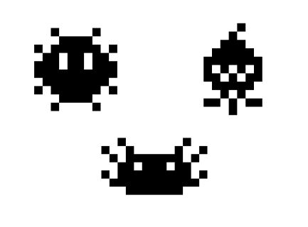
One of the iconic pixel aliens you fight in Space Invaders, which resemble sea creatures, has been a symbol of gaming for years. I created 3 characters in that same style based on a squid, a blowfish, and an axolotl. I initially wanted to use these characters more prominently throughout the app, but I just kept them as decorations on the Login screen and the Congratulations screen after getting a score.
All color combinations comply with the recommended minimum 4.5:1 contrast ratio for accessibility purposes.
These are some examples of low-fidelity interfaces I designed in Figma:
HomepagePrizesFriends
-300w.jpg)
-300w.jpg)

I carried out a supervised usability test with 3 users consisting of 5 tasks, and identified the following issues:
• The Back icon on the upper left corner confused all 3 users.
• The process to add a game score manually was unclear.
• Two users suggest the QR button should actually depict a QR code to convey its purpose.
High-Fidelity Prototype
Hi-Fi Figma PrototypeFor the high-fidelity design, I wanted a style that evoked nostalgia and the 80's craze for arcades but still looked modern to users. I got inspired by Space Invaders, one of the most popular games of the era: I designed pixel-based icons and used a blue-yellow color palette. I thought of using a pixel-based font for the app's headings, but I dismissed the idea in favor of legibility. I did use that font for representing numbers, as we are much more used to reading numbers in that style. Anywhere else except for the logo, I used Helvetica, as it is legible and it was a popular font in the 80's.
One of the iconic pixel aliens you fight in Space Invaders, which resemble sea creatures, has been a symbol of gaming for years. I created 3 characters in that same style based on a squid, a blowfish, and an axolotl. I initially wanted to use these characters more prominently throughout the app, but I just kept them as decorations on the Login screen and the Congratulations screen after getting a score.
All color combinations comply with the recommended minimum 4.5:1 contrast ratio for accessibility purposes.


 Back to Top
