American Labor Interactive gallery for 20th century poster art
Context

When
October - November 2023
Where
Academic project, Harvard MDE
Who
Team of 2. Data Analysis, UI/UX
Why
Poster artwork has accompanied American labor movements
to, as the popular saying says, “educate, agitate, and
organize”. The historian Lincoln Cushing illuminates us
on the history of these posters in his homonimous book.
This project’s goal was to explore how to augment the
reach of his work and allow new audiences
to understand the deeper significance of each
poster and identify patterns across time.
Approach
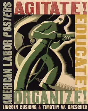 Our journey began with correspondence with the author
of "Agitate! Educate! Organize! American Labor
Posters". The book features 250 posters organized in 10 themes,
but we could have access to the 750 labor posters that
the author had collected.
Our journey began with correspondence with the author
of "Agitate! Educate! Organize! American Labor
Posters". The book features 250 posters organized in 10 themes,
but we could have access to the 750 labor posters that
the author had collected.What can we learn about American labor movements through an exploration of the semantics, aesthetics and contextual settings of labor graphics?
Employing manual labeling and a combination of no-code and Python tools, we analyzed our dataset through different lenses and finally scultped our prototype using primarily Figma and P5.
The book features 250 posters organized in 10 themes, but we could have access to the 750 labor posters that the author had collected.
Employing manual labeling and a combination of no-code and Python tools, we analyzed our dataset through different lenses and finally scultped our prototype using primarily Figma and P5.
What can we learn about American labor movements through an exploration of the semantics, aesthetics and contextual settings of labor graphics?
Exploration
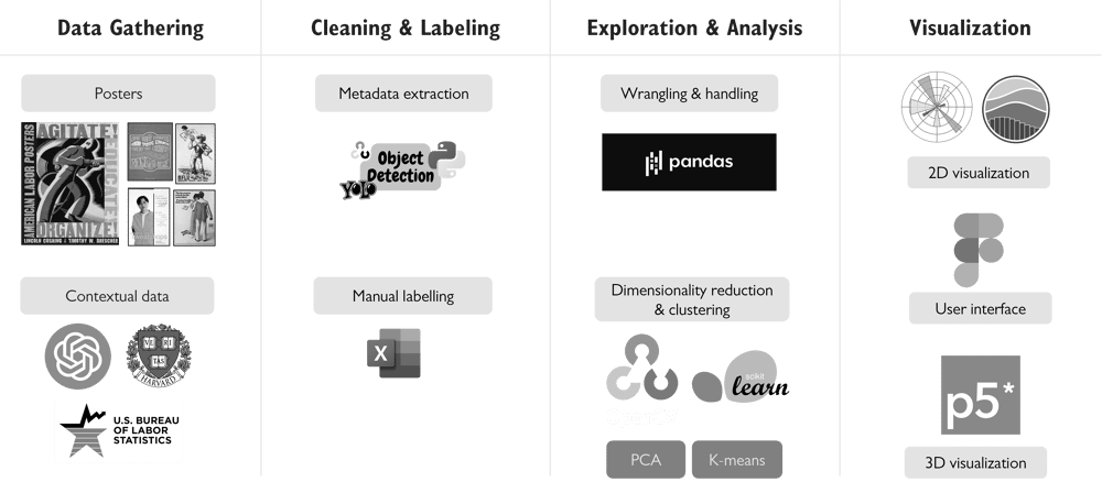
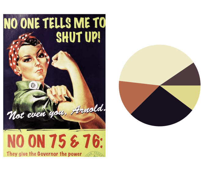
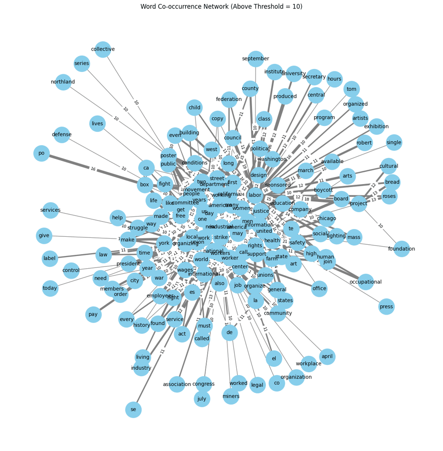
Below, some sample results of the color and textual
analysis we performed with Python libraries (Pandas, OpenCV
and Tesseract) with the goal to identify patterns in the
posters. Though we did identified some, we weren't convinced
they were powerful enough to highlight them in the gallery.
We pivoted to using information collected from manual
labelling, especially subjects represented, objects and
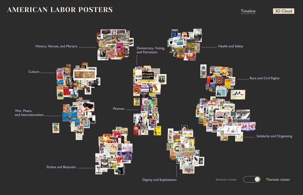
semantic theme. We used Principal Component Analysis to
found mathematical relationships between the posters.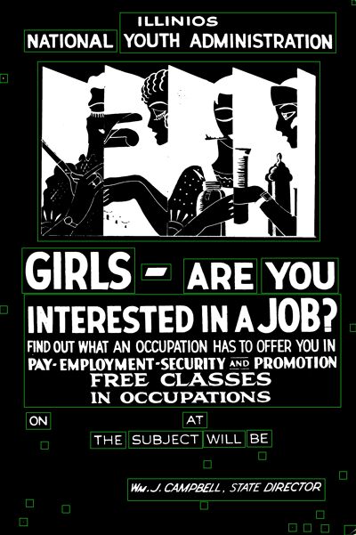


Design
To design the gallery, we first wanted to keep the themes
of the book as much as possible. Our idea for the landing
page involved creating 3 main features for the gallery
inspired by the words "Agitate", "Educate" and "Organize",
and we even thought of giving it our own tweak with the
word "Visualize". This exploration allowed us to
brainstorm several visualization techniques.
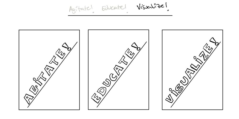 Visualization proposals for three main features We ended up with the following three main
features. Though these features made it to the final
design in some form, we scrapped the idea of using the words
of the book title to represent them, as we felt they were
all agitating, educating and organizing in their unique
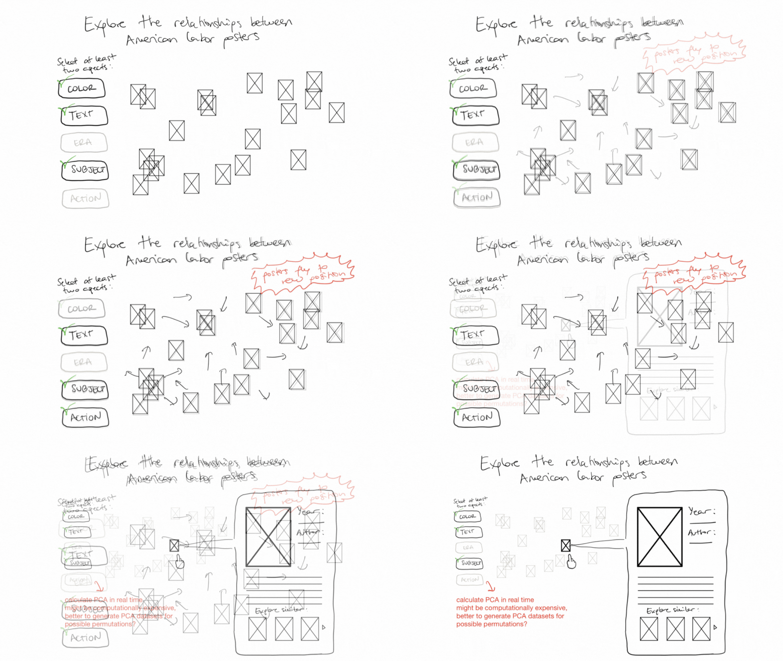
way. Agitate: Poster Cloud?
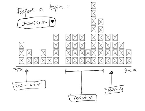
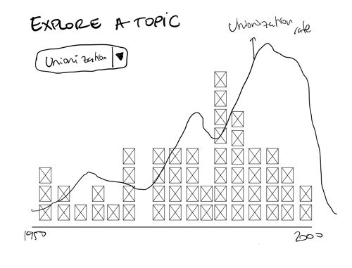
 Educate: Timeline View?
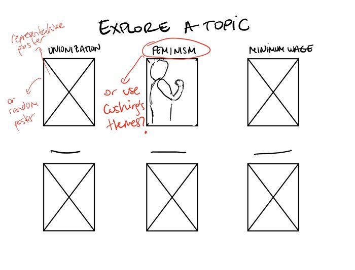
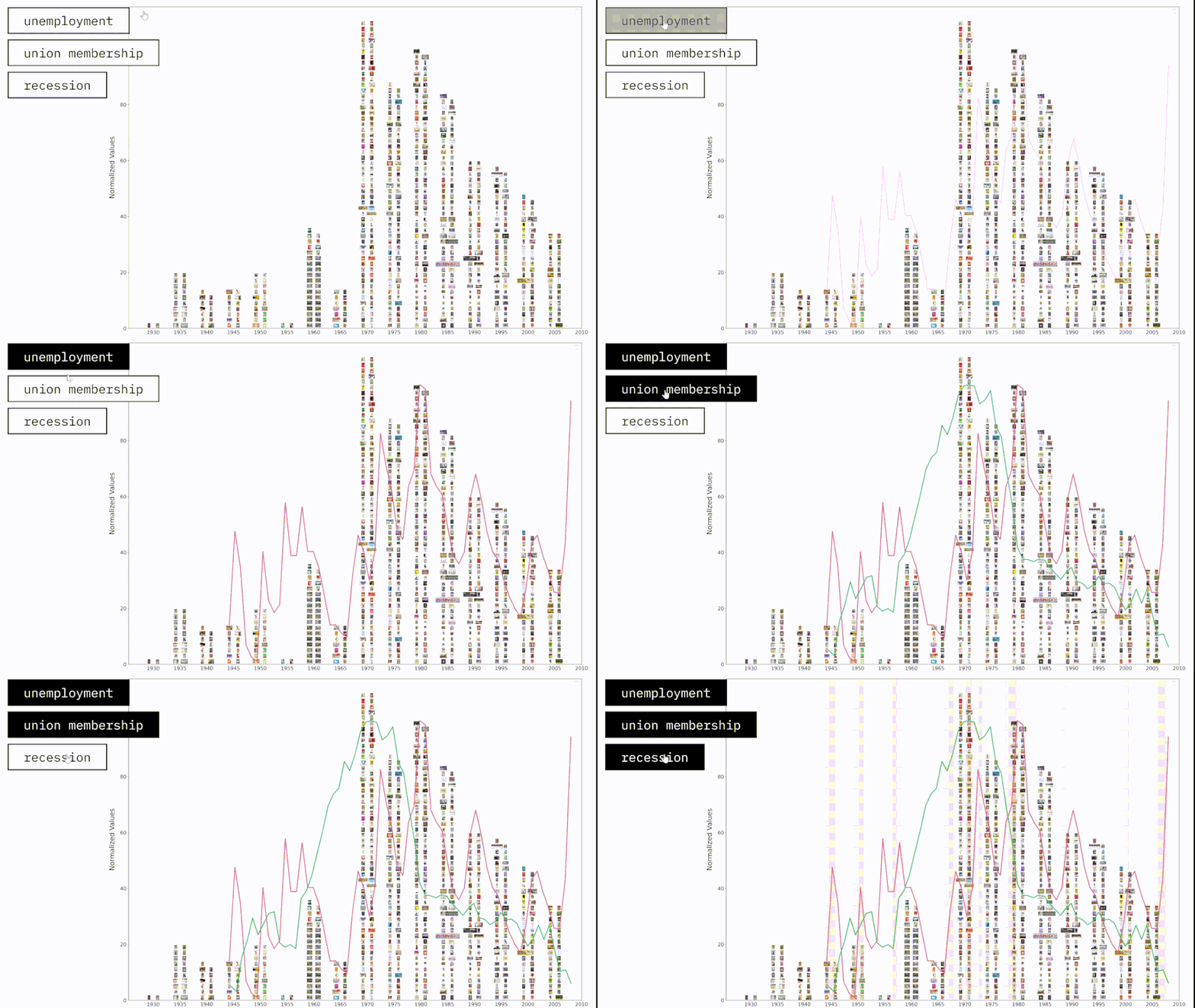 Organize: Semantics and Color by Theme?
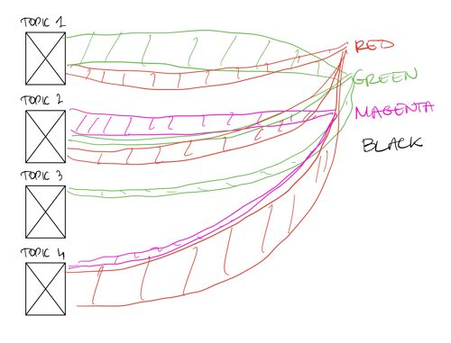
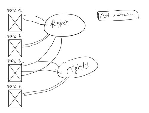
 Visualization proposals for three main features We ended up with the following three main
features. Though these features made it to the final
design in some form, we scrapped the idea of using the words
of the book title to represent them, as we felt they were
all agitating, educating and organizing in their unique
way. Agitate: Poster Cloud?
 Educate: Timeline View?


 Organize: Semantics and Color by Theme?

Gallery
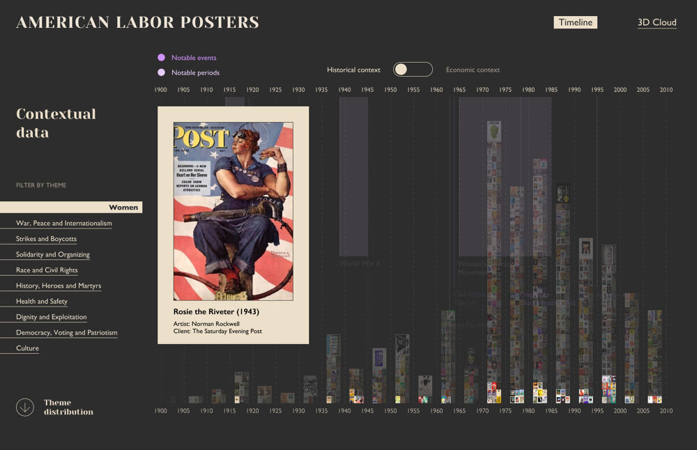
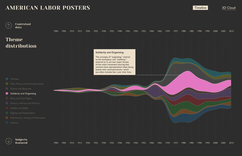
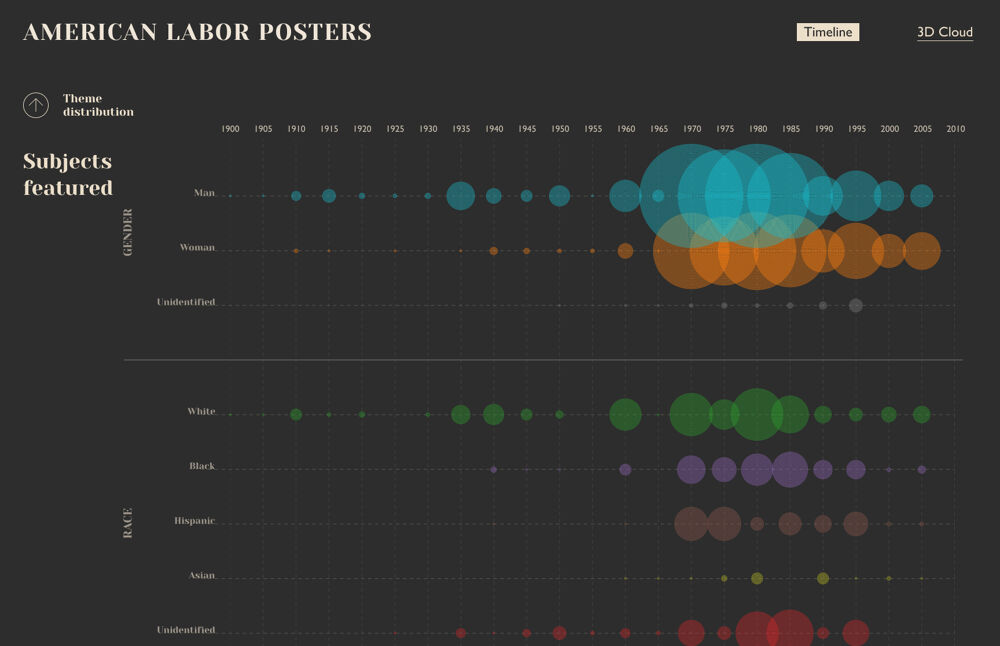
The final prototype includes the timeline view first, which
allows to overimpose historical events and economic data to
understand the relationships between the context and the
posters. This view also allows the user to check how gender
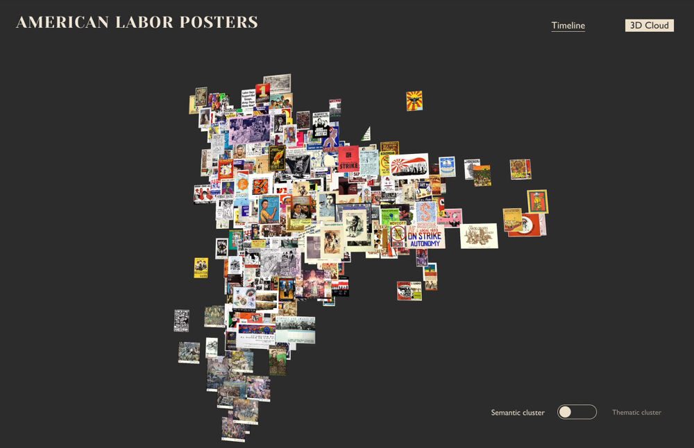
and race gets represented over time. With a simple change of
tab, we can switch to the 3D cloud view.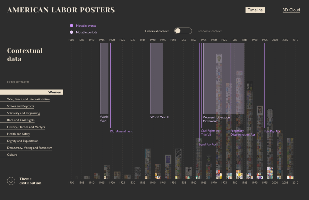


 Back to Top
